Mapping Vulnerability + Spatial Statistics
Part I: Explore SVI vulnerability dataset + Histogram and Statistic Tool
The direct download of the CDC SVI dataset has been reprojected to an equidistant projected coordinate system (USA_Contiguous_Equidistant_Conic) in order to run distance-based statistical tests in this demonstration lab.
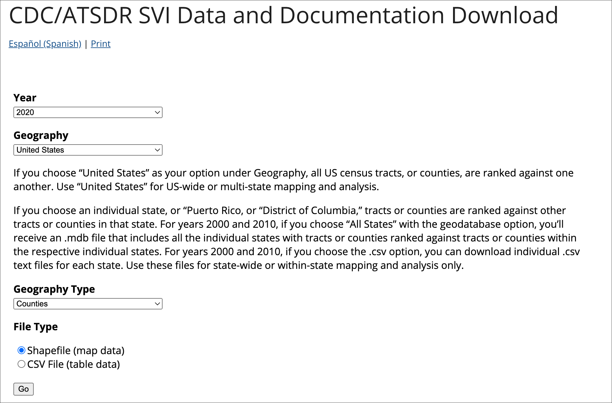
To start, we will access the latest 2020 SVI dataset for US Counties:
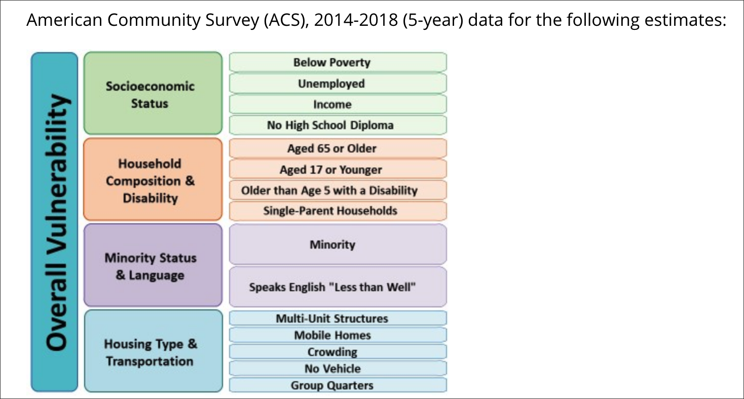
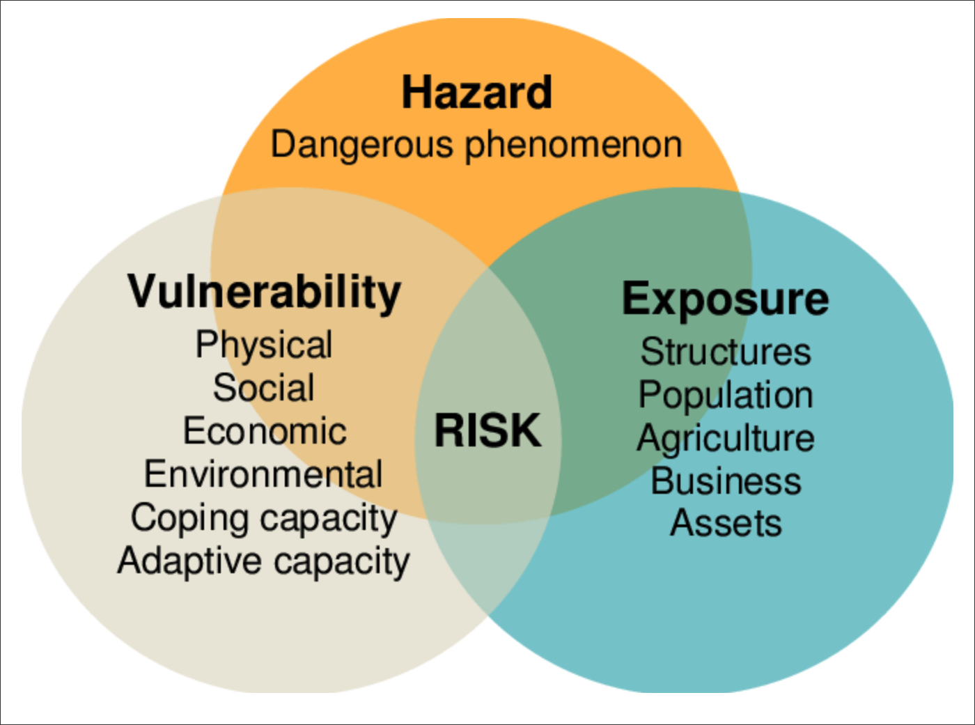
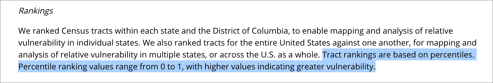
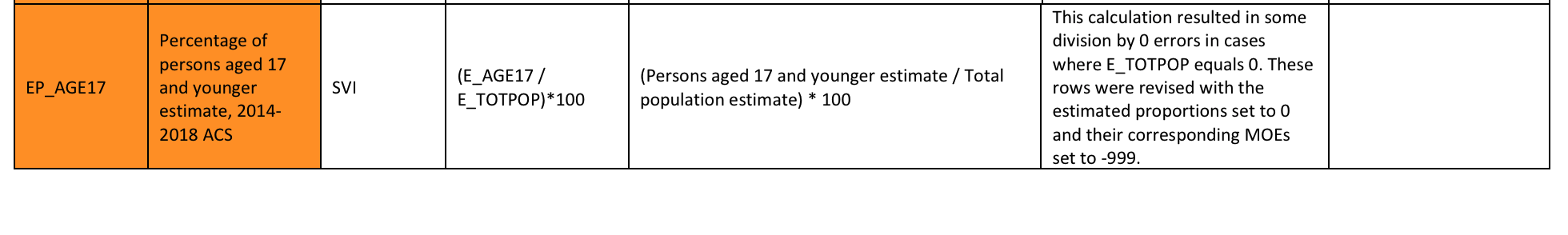
As discussed in the 2020 CDC SOVI Model documentation, the dataset’s theme structure is scored based on a percentile rank. Percentile scoring highlights the ‘below’ values for any percentile position within the dataset.
A percentile is a comparison score between a particular score and the scores of the rest of a group. It shows the percentage of scores that a particular score surpassed.
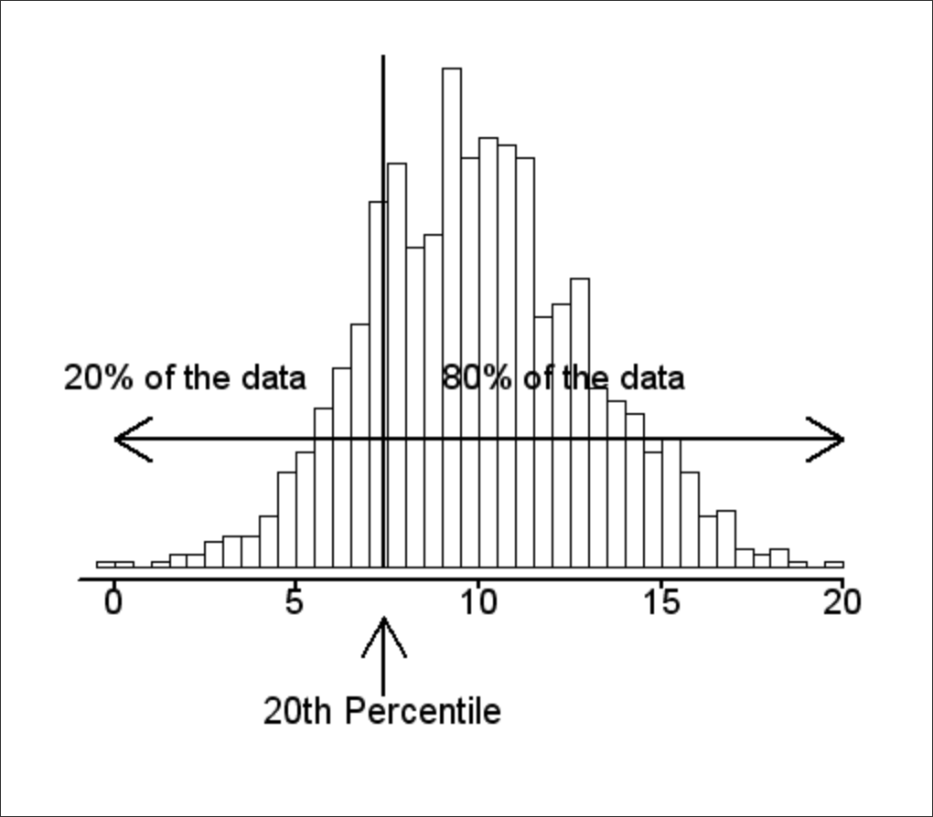
Relative to a quartile statistical approach, the following statements can be made about the percentile approach to scoring:
- The 25th percentile is also called the first quartile.
- The 50th percentile is generally the median.
- The 75th percentile is also called the third quartile.
- The difference between the third and first quartiles is the interquartile range.
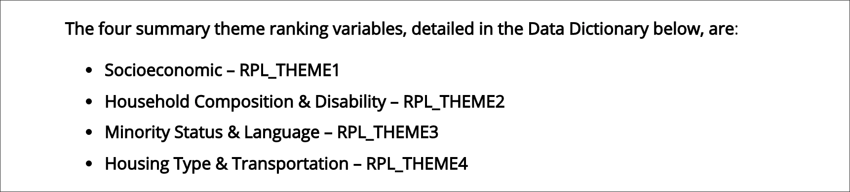
With ArcCatalog open and pointed to the datasource SVI2020_US_COUNTY, first map on RPL_THEMES and explore the percentile approach in the mapping:
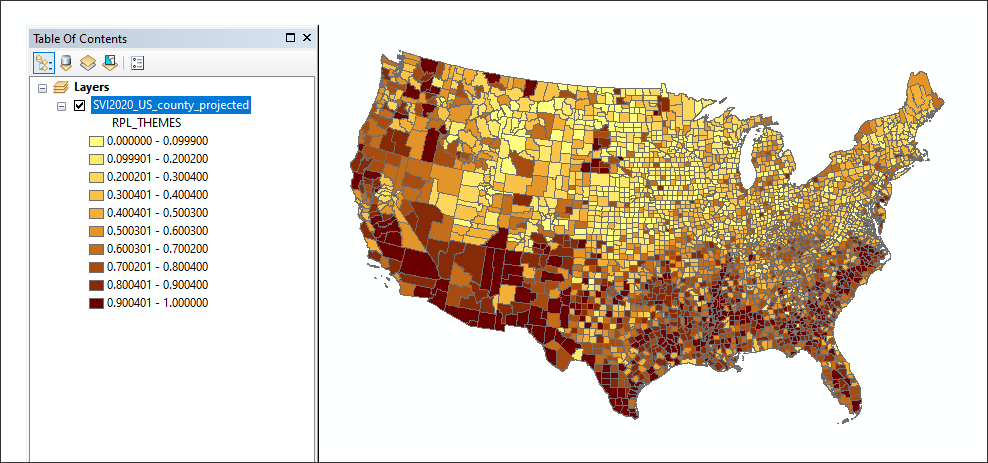
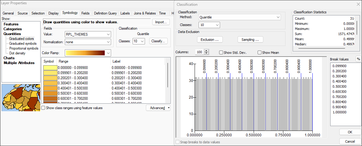
Note that the statistical summary for RPL_THEMES shows this variable is normalized 0-1. Note the following CDC SOVI methods statement for its scoring:
Part II: Min - Max Normalization
Following a statistical exploration of the RPL_THEMES, we will turn to the variable EP_AGE17 - percentage of persons age 17 and younger, estimated. Note that this is not the absolute value population; it is already process through a lower-level normalization. Run the Geostatistical Analyst Histogram tool on variable EP_AGE17:
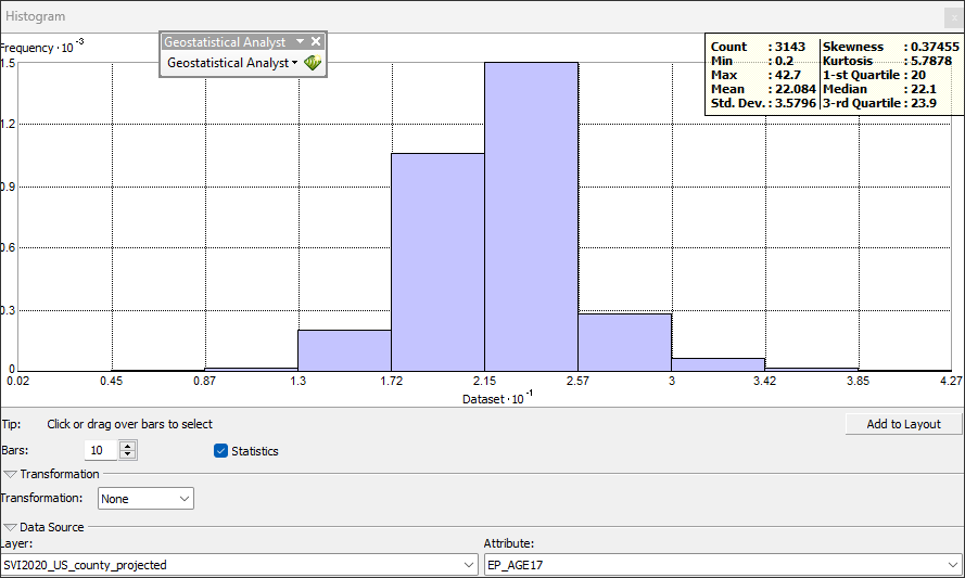
From the Statistical Summary, the attribute EP_AGE17 has the following minimum and maximum values:
MIN =
0.2MAX =
42.7
The universe of values can be anywhere from 0.2 upwards to 42.7.
A typical approach to normalize an array of values as found in EP_AGE17 is the technique Min - Max Normalization.
Min-Max normalization is a scaling technique in which values are shifted and rescaled so that they end up ranging between 0 and 1.
The following equation is utilized for this method of normalization:
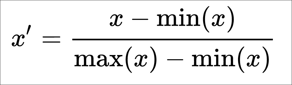
Using the formula, the following equation can be applied to a new column in Field Calculator titled MM_17, type double:
Formula = X new = (X – X min) / (X max – X min)
Translated to the EP_AGE17 attribute:
([EP_AGE17]-0.2)/(42.7-0.2)
The Min - Max Normalization can also be performed for a custom range, i.e. 1 > 10 as opposed to 0 > 1 as we have done thus far. The formula for this normalization is as follows:
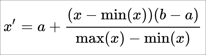
a and b are the min-max values of the attribute array.
Part IV - Clusters of Similarity
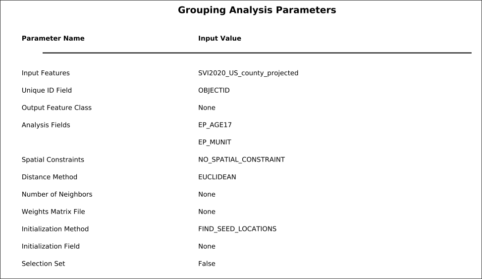
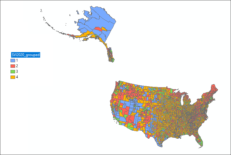
The purpose of normalization is typically to normalize multiple variables across different measurements in order to create consistency in a final scoring mechanism. We can hand over a final scoring process to a clustering algorithm that will ‘compare’ or ‘evaluate’ the values in one variable column to those of other variable columns, resulting in ‘similar’ groupings or clusters. The disadvantage of this approach is that the resulting clusters don’t show ‘directionality’ in the resulting map; that is, we can’t see in the categorical result of the clustering process the type of relationship of the variables in the clusters, just that the resulting clusters are of similar pattern between the variables inside the cluster and dissimilar outside the cluster.
With clustering - also known as group analysis, we may want to find cluster patterns between two variables as follows:
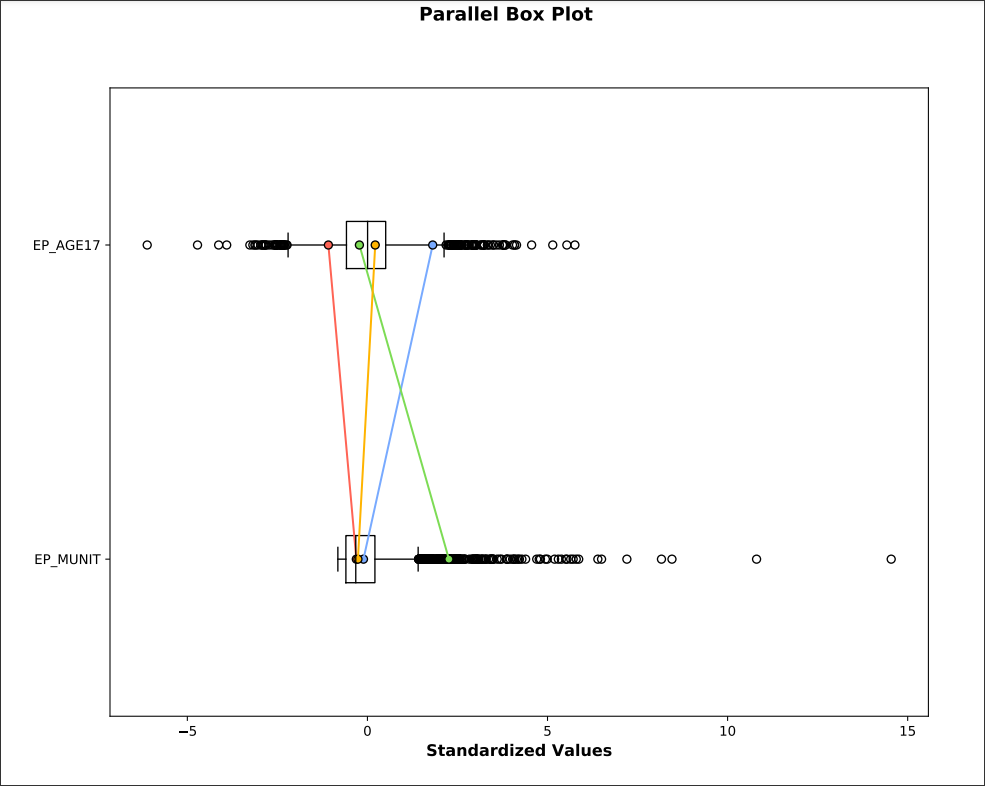
Housing in structures with 10 or more units -
EP_MUNITPersons aged 17 and younger -
EP_AGE17
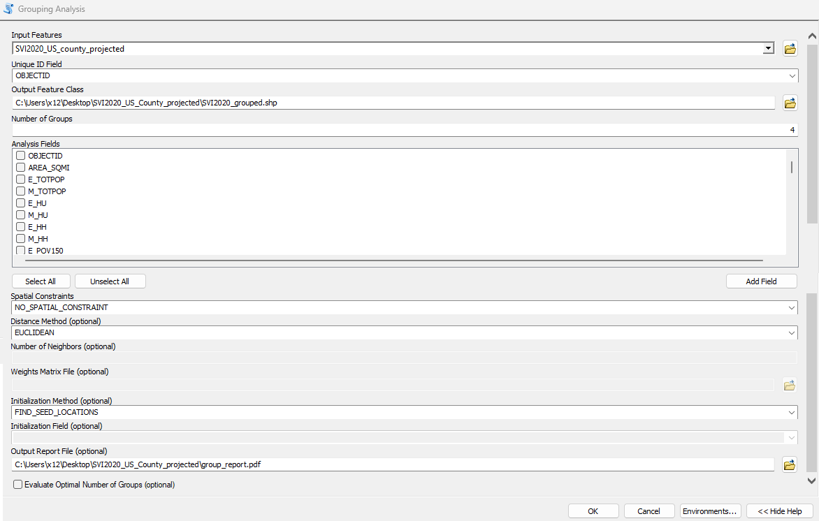
In ArcGIS there are robust clustering tools that utilizes several algorithms. For the demonstration we will use the Grouping Analysis tool:
Next, Populate the tool with the following parameters:
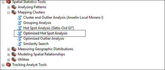
Part V - Hot Spots and Cold Spots
The phrase Hot Spot Analysis refers to a series of statistical methods to determine clustering of ‘like’ values - both low and high values. This can help find spatially and statistically significant clusters of similar valued geographies.
Hot Spot Analysis evaluates where either high or low values cluster spatially within a spatial dataset. These tools works by looking at each feature within the context of neighboring features. A feature with a high value is interesting but may not be a statistically significant hot spot. To be a statistically significant hot spot, a feature will have a high value and be surrounded by other features with high values as well; the converse is true for cold spots with low values.
To start, navigate to the Optimized Hot Spot Analysis tool:
Next, populate the tool as follows:
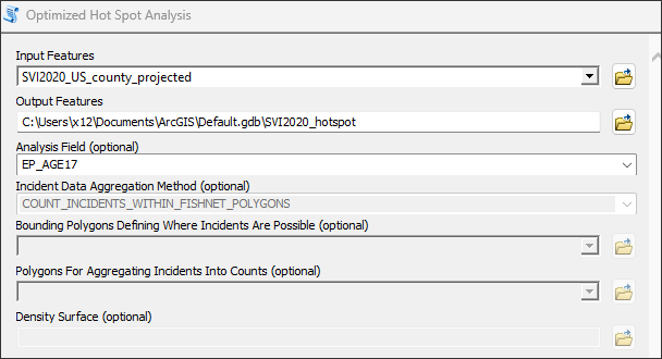
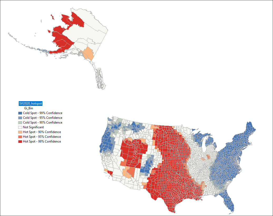
EP_AGE17